DABBA - 44
As a significant portion of India’s workforce moves away from home for employment or higher studies, managing daily meals becomes a daunting challenge. Indian students traveling abroad, particularly to London, often grapple with the fear of missing healthy, home-cooked meals, especially authentic Indian food. To address this, we launched a high-quality Indian tiffin service in London, delivering delicious, home-cooked Indian meals straight to your doorstep.
Service
Business Research
Client
UAL
Year
2020

UNDERLYING RATIONALE
The initiative was more than just a business idea or a solution for a niche audience—it was a way to give back to the community. By partnering with Indian women on spouse visas, who often struggled to find employment, we provided them with an opportunity to achieve financial independence and build a sense of purpose. Our mission was further supported by the municipal authorities from Ealing Borough, whose aid was instrumental in making this service a reality. Through this endeavor, we not only ensured that our customers never had to miss their mom’s cooking but also empowered a community of women while celebrating Indian culinary traditions abroad.
PROBLEM STATEMENT
How might we create a tiffin service that will provide home cooked food which I healthy and affordable to Indian adults at the same time providing employment opportunities for mother's in Indian households in London ?
01
The goal is to offer Indian adults affordable, homemade, and delicious meals through a thoughtfully designed tiffin service business model.
02
To provide customers with healthy meals while continuously adapting to the evolving health-conscious behaviors of the target audience.
03
It also aims to create employment opportunities for Indian mothers in London households.


BUSINESS MODEL CANVAS + CUSTOMER PERSONA + CUSTOMER JOURNEY MAPPING + COMPETITORS
THE BRAND STRATEGY
BRAND ESSENCE
Our focus is on building a client-centric brand rather than solely promoting the brand's agenda. A brand thrives when it resonates with clients and connects with their lives in meaningful ways. By fostering this connection, we aim to create a sense of commitment that becomes a microcosm of our clients' experiences. Our goal is to build a community—a platform for individuals to share the small moments that define their lives, regardless of where they come from.
BRAND POSITIONING
Our goal is to focus on creating a client-centric brand rather than emphasizing the brand’s own objectives. A brand thrives when it connects with clients in ways that are meaningful to their lives. By fostering such connections, we can cultivate a sense of loyalty and build a close-knit community of clients. We aim to create a platform where individuals can share the small, defining moments of their lives, regardless of where they live, fostering a sense of belonging and shared experiences.


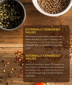
KEY VALUES OF THE BRAND
TASTE
HOLISTIC HEALTHY MENU
SUSTAINABLE AND CLEAN PACKAGING
SOCIAL EMPOWERMENT
FINANCIAL INDEPENDENCE
HOSPITABLE HOST
NOSTALGIA
CONVINIENCE
LOGO ITERATIONS
The centerpiece of our logo is the vibrant and iconic 'TIFFIN.' Drawing inspiration from my homeland, the concept harks back to the renowned Dabbawallahs of Bombay. The tiffins they use are distinguished by their unique form and shape, designed to maintain uniformity and prevent mix-ups—a design that has become iconic in itself.
The final logo captures the essence of nostalgia, evoking memories of innocence, domesticity, family, and the tantalizing aroma wafting from kitchen kadhais. It symbolizes simplicity while offering something to look forward to—like the comforting magic of home. It remains consistent physically but stirs emotions of contentment and joy every time. This logo encapsulates the warmth and familiarity of home-cooked meals, creating a sense of belonging and happiness.


FINAL LOGO

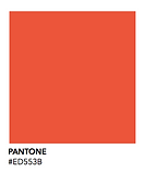
COLOR PALETTE
The color palette for 'DABBA - 44' is as simple and earthy as its name, inspired by the natural tones found within the culture and landscape of the region. The chosen colors reflect organic elements, seen in local flora, vegetables, kitchen spices, and even the earthy rust of terracotta. These hues are carefully selected to avoid being jarring or overly flashy, maintaining a harmonious balance between the country’s topography and its natural environment. The palette is designed to resonate with the local community, blending seamlessly with its everyday surroundings. Additionally, I developed a visual language that is highly flexible, allowing it to easily adapt to the expanding variety of flavors and product offerings.


BRAND IDENTITY


